Sunday, July 16, 2006

The Right Paper for the Write Job

Ms. DSK's appreciation of the finer points of pencils is evident in our previous blog entry, but the fact remains that no matter how fine the writing tool, it still needs something to write on. Many writers become a little, well, idiosyncratic in their insistence on one particular type of paper or the other-- such as the legal pad. We've known more than one writer who claimed to be unable to put words down on paper without just the right pen or pencil and paper.

While we tend to take such a mundane item as the legal pad for granted, it is a relatively recent invention. Otherwise, the Declaration of Independence would doubtless be saved on long, yellow pages.

LegalAffairs: The Magazine at the Intersection of Law and Life, has a nice history of the legal pad in its May/June 2005 issue. "Old Yeller," by Suzanne Snider, recounts the history of the legal pad. In 1888 a 24 year old worker in a paper mill in Holyoke, Massachusetts, had the idea of binding paper scraps from the mill into a pad. He founded his own company to produce them, and in the early 1900s he added the line down the left hand margin at the request of a judge. When and where the standard yellow color was introduced is not clear. Here is Snider's full article.

And then there's that old friend of students, the spiral notebook--though less fondly appreciated by generations of composition teachers weary with bits of paper hanging to the margins of student essays torn from said notebooks.

It turns out the advent of the spiral notebook was covered in the October, 1934 edition of Popular Science. A copy of the ad is reproduced at Modern Mechanix , which reported "Coil springs form flexible bindings for a new type of memorandum books. One edge of the covers and pages of the book are perforated with more than twenty holes and the coil spring is threaded through these holes to make a permanent binding, as shown above." Here's the link.

Finally, there is the granddaddy of them all -- the three ring binder, although actually it started life as a two ring binder and which was first patented in 1853.

Earlyofficemuseum.com has a wonderful online collection of early office materials as well as historical details on their introduction. The site has a copy of this 1899 advertisement for the two ring binder, which it says is the first advertisement for this type of loose leaf filing system. Here's link to earlyofficemuseum's page on early filing devices.

Tuesday, July 11, 2006

The Right Tool for the Write Job

He brought out a yellow nickel tablet. He brought out a yellow Ticonderoga pencil. He opened the tablet. He licked the pencil.

Douglas licked the yellow Ticonderoga pencil whose name he dearly loved.
Like Douglas in Ray Bradbury's Dandelion Wine, I have loved yellow Ticonderoga pencils, especially the Ticonderoga No. 2 Tri-Write, which is so comfortable in the hand.

For serious writers and animators, however, only one pencil will do--the pencil--the Eberhard Faber Blackwing 602. (Its motto: "Half the pressure, twice the speed.") Sadly, Faber-Castell USA ceased making the Blackwing in 1998 and urged customers to buy the Prismacolor Turquoise Drawing Pencil 4B instead. For professionals, the Turquoise simply won't do. Instead, people are still buying old Blackwings where they can find them, such as on eBay for about $33 a pencil.

Picture of Palomino pencil and sharpenerPencil bloggers, however, have found a new, promising pencil. In a pencil quality test, Ninth Wave Designs identified the California Republic Palomino HB and 2B as the winners.

Pencil Revolution (a pencil blog) also gives the Palomino pencil high ratings, as well as the KUM Automatic Long Point Sharpener produced by Palomino.

I've bought both the Palomino Graphite HB (with eraser . . . I make a lot of mistakes) and the long point sharpener, and I love them and recommend them without reservation. They are available online only from California Republic Stationers' eBay store (Pencil World Creativity Store).

Sidebar: Blackwing 602s are so coveted that one fellow in Burbank--MrDailyBread--is conducting a treasure hunt for them. He bags up a pencil, hides it in the Burbank area, and then posts clues for treasure-hunters. You can read about the hunt on his blog.

You can read a Boston Globe article about the demise of the Blackwing and the fanatical devotion it attracts on Tech Observer.

Monday, July 03, 2006

Another Plagiarist in the News

In our recent post Plagiarism in the real world we listed a number of famous people who had been accused of plagiarism. Well, we can add Ann Coulter to the list.

The New York Post, in a Philip Recchia July 2nd article entitled "Copycatty Coulter Pilfers Prose: Pro" (one of the more alliterative titles we've run across of late), reports that "Conservative scribe Ann Coulter cribbed liberally in her latest book, 'Godless,' according to a plagiarism expert."

The article is based on the work of John Barrie, creator and CEO of the plagiarism recognition software company iThenticate. Barrie ran Coulter's recent work Godless
through his software, as well as many of her weekly columns.

Barrie reports three instances of plagiarism in Godless. While brief--each instance ran between 20 and 30 words--they would have been enough to condemn a student who committed the same act. Barrie also notes that many of the hundreds of citations in Godless were "misleading" and designed to give the impression of a level of academic credibility which simply isn't there.

In addition to Godless, Barrie also ran many of Coulter's columns though iThenticate and found the same pattern: sentences lifted from other sources and inserted into her work.

Sunday, July 02, 2006

2006 Industrial Design Excellence Awards

Business Week sponsors a yearly contest for the best Industrial Designs. The 2006 Industrial Design Excellence Awards (IDEA) are now up at IDEA web site.

We've included a few of the designs below. They include a backpacking tent which pops open in two seconds, a new design for a protective cup for baseball players, a pod shaped biodegradeable coffin, a wall socket designed to be easily seen by someone who is standing, and a $100 dollar computer powered by a hand-cranked generator for children in developing countries.


Here are the Top IDEA Winners in the Consumer Products category. You can view other category winners by clicking on the dropdown link at the top of the page.

Friday, June 30, 2006

Some of Us Got in This Business Because of Fairies

It turns out that Ann Arbor, Michigan, harbors a number of Fairy Doors in buildings to accommodate the Urban Fairies of the city. You can see the entire collection of Fairy Doors online thanks to the efforts of Jonathan B. Wright.

Since fairy stories were among my first literary experiences, I'm glad to see fairies are so honored in Ann Arbor.

The Eyes of Doctor T. J. Eckleburg


But above the gray land and the spasms of bleak dust which drift endlessly over it, you perceive, after a moment, the eyes of Doctor T. J. Eckleburg. The eyes of Doctor T. J. Eckleburg are blue and gigantic--their irises are one yard high. They look out of no face, but, instead, from a pair of enormous yellow spectacles which pass over a nonexistent nose. --The Great Gatsby, Chap. 2

In F. Scott Fitzgerald's Gatsby, the spectral eyes of Doctor T. J. Eckleburg look out from a billboard over a wasteland. Some interpreters say they are a symbol of God's eyes; others focus on the "TJ" and think of the failed agrarian vision of Thomas Jefferson. In any case, those eyes are spooky and seem to pass judgment upon the careless behavior they witness in the novel.

As it turns out, Fitzgerald was on to something.

The BBC reports that a pair of big brother eyes looking out from a poster boosts people's honesty. A study from Newcastle University monitored how much money people deposited in a coffee canteen's honesty system. When the poster with prices featured flowers, people paid only a third of what they paid when the poster featured a picture of human eyes.

One of the researchers concluded "the eyes on the poster may affect people's perception that they are being watched by other people." She continued, "It does raise the possibility that you could get people to behave more co-operatively or pro-socially by putting up pictures of eyes. . . . It would work particularly in instances where people have to make a choice between whether to behave well or badly."

I don't know . . . people still behaved pretty badly in The Great Gatsby.

Thursday, June 29, 2006

40 Greatest Magazine Covers

In October of 2005, the American Society of Magazine Editors picked their top 40 magazine covers of the last 40 years. According to the ASME press release,
A judging panel of 52 magazine editors, design directors, art directors and photography editors was charged with picking the 40 top covers from a pool of 444 images representing 136 magazines. The contest was open to all consumer magazines published in the United States. Magazines were invited to submit up to four entries from their respective publications. Entrants were also encouraged to nominate covers of magazines that were not published by their company or were no longer being published.
The ASME never spells out its criteria for a great cover, but the results speak for themselves. Regardless of the topic, they are all arresting. Here are a few of our favorites, along with their respective rankings:

#4 The March 29, 1976 New Yorker cover by Saul Steinberg offers a New Yorker's slightly biased view of America. Those of us in the west always suspected as much.


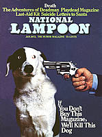
# 7 The National Lampoon's 1973 cover read "If you don't buy this magazine we'll kill this dog." The dog's eyes say it all.


#23 The November 13, 2000 issue of The Nation was published while the results of the 2000 election were still pending and focused on what a George W. Bush administration might be like. Note the subtle resemblance to another one of our heros, Mad Magazine's Alfred E. Newman.


For a complete listing of the winners, (and you really want to know which one came in as #1, don't you?) as well as background information on each of the winning covers, see ASME's Top 40 Magazine Covers of the Last 40 Years.

Wednesday, June 28, 2006

The Queen-Mother of Dirty Words

The movie: A Christmas Story
The scene: Ralphie helping his dad change a tire
The event: Ralphie spills the hub cap and the lug nuts go flying into the snow.
Ralphie: Oooh fuuudge!
Ralphie as Adult: Only I didn't say "Fudge." I said THE word, the big one, the queen-mother of dirty words, the "F-dash-dash-dash" word!
Mr. Parker: What did you say?
Ralphie: Uh, um...
Mr. Parker: That's... what I thought you said. Get in the car. Go on!
Ralphie as Adult: It was all over - I was dead. What would it be? The guillotine? Hanging? The chair? The rack? The Chinese water torture? Hmmph. Mere child's play compared to what surely awaited me.
Switch to Ralphie, a bar of soap in his mouth, being grilled by his mother:
Mother: Alright. Now, are you ready to tell me where you heard that word?
Ralphie as Adult: Now, I had heard that word at least ten times a day from my old man. He worked in profanity the way other artists might work in oils or clay. It was his true medium; a master. But, I chickened out and said the first name that came to mind.
Ralphie: Schwartz! (Link)
Alas for poor Schwartz when his mother heard the news. And yet, in spite of the valiant efforts of mothers in English speaking countries around the world, it is a word which just won't go away.
Our previous entry, "No Frakkin'Way!", focused on current standards and usage of swear words. For a more in depth treatment of the etymology, history, and legal implication of the use of the F-word, the "gold-standard" of profanity, see Christopher Fairman's excellent article "Fuck."

In his abstract, Fairman, a faculty member at the Ohio State Moritz College of Law who waited until after he was awarded tenure to write this article, says
This Article is as simple and provocative as its title suggests: it explores the legal implications of the word fuck. The intersection of the word fuck and the law is examined in four major areas: First Amendment, broadcast regulation, sexual harassment, and education.
Make no mistake: this is a scholarly treatment of our most taboo word (although some linguists argue that it has slipped to third in the taboo word rankings).

Of particular interest to teachers--both high school and college-- is Fairman's review of legal precedent surrounding dismissal of teachers who have used the term in class. It is an area of some confusion, with some courts holding that the teacher's right to free speech does not apply in the classroom, while others have held that there are legitimate curricular reasons for the use of taboo words in a classroom.

Here are a few additional links:
"The Big One" -- from the Boston Globe
The F-Word --
Lexicon of current usage

Tuesday, June 27, 2006

No Frakkin' Way!

This spring, we've been following Language Log's discussion of swear words in print. The linguists at Language Log have no patience with publications such as The New York Times which choose cloying coyness over taboo words. They much prefer the approach of the Guardian and the Economist, both of which will use a swearword judiciously. As the Guardian's online Style Guide says,
We are more liberal than any other newspaper, using words such as cunt and fuck that most of our competitors would not use.

The editor's guidelines are straightforward:

First, remember the reader, and respect demands that we should not casually use words that are likely to offend.

Second, use such words only when absolutely necessary to the facts of a piece, or to portray a character in an article; there is almost never a case in which we need to use a swearword outside direct quotes.

Third, the stronger the swearword, the harder we ought to think about using it.

Finally, never use asterisks, which are just a copout, or as Charlotte Bronte elegantly put it: "The practice of hinting by single letters those expletives with which profane and violent people are wont to garnish their discourse, strikes me as a proceeding which, however well meant, is weak and futile. I cannot tell what good it does - what feeling it spares - what horror it conceals."

The Language Log discussion covers a number of techniques media and subcultures use to avoid taboo words, including off-word substitutions (such as flip) or coded obscenities (such as Battlestar Gallactica's use of frak) as well as invented swearwords (such as Science Fiction writer Larry Niven's tanj, derived from "there ain't no justice") and avoidance characters (such as f**k or @#$!).

For more reading, see

Sunday, June 25, 2006

Gallery of Regrettable Food

Every once and awhile we run across a web site so special it is as if its very existence justifies the internet.

James Lileks' web site falls into this category. Lileks.com (Humiliating Defenseless Ephemera Since 1996) presents wonderful photos, advertisements, and other stuff (it's really rather hard to categorize) from the 30's, 40's, and 50's--mostly.

Doubtless we will dip into Lilek's site in future postings, but to start with we were taken with the Gallery of Regrettable Food, which highlights a variety of special recipe collections. Stroll back through memory lane (at least for some of us) and sample
  • Cookout Champion BBQ Tricks
  • Knudson Recipes for Greater Food Value
  • More Fun with Coffee
  • Better Homes and Gardens Meat Cook Book
  • Knox On-Camera Recipes (Gelatin as seen on TV!)
  • Cookin with Dr. Pepper
  • and many, many more!
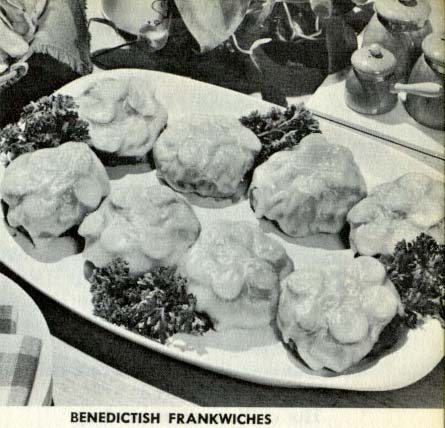
Our personal favorite is Good Housekeeping's Ten PM Cook Book. We confess we are rarely up that late, but if we were we would certainly like to try out some of these offerings. The Benedictish Frankwiches look particularly tasty, even though they are aimed at a teen audience.

If you are in need of a coffee table book to impress the company, the Gallery of Regrettable Food is available in hard copy, also suitable for propping by the stove while you whip up a tasty gelatin mold with Dr. Pepper and green olives.